 Login
Login- Understanding Fluid Typography
- The Benefits of Fluid Typography
- How to Implement Fluid Typography
- 1. Use Relative Units
- 2. Mix Fixed and Fluid Sizes
- 3. Utilize Media Queries
- 4. Test Across Devices
- Challenges and Considerations
- Conclusion
In an era where responsive design is paramount, ensuring that text is not only readable but also aesthetically pleasing across various devices can be a challenging task. Fluid typography addresses this issue by allowing text to scale seamlessly based on the viewport size, enhancing both usability and the overall visual experience. This technique dynamically adjusts font sizes, leading to a more harmonious and flexible reading experience, whether on a smartphone, tablet, or desktop computer.
Understanding Fluid Typography
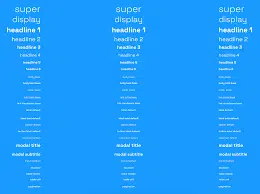
At its core, fluid typography uses relative units like percentages and viewport width (vw) to adjust font size based on the dimensions of the user’s screen. Unlike traditional typography, which often relies on fixed pixel sizes, fluid typography promotes a responsive design ethos by ensuring that text remains legible and proportionate across devices. By leveraging CSS properties, developers can create a site that not only looks good but also reads well.
The Benefits of Fluid Typography
-
Improved Readability: One of the primary advantages of fluid typography is enhanced readability. Text that scales with the viewport size ensures that users don’t need to squint or zoom in to read content, particularly on smaller screens.
-
Consistent Design: Fluid typography helps maintain design consistency across various devices. By letting fonts scale in relation to the viewport, designers can preserve their intended visual hierarchy, making for a cohesive experience for the user.
-
Better User Experience: A website featuring fluid typography removes barriers that might affect the user experience. Whether users are accessing a site on a mobile device or a large monitor, fluid typography adapts, allowing for a more engaging interaction.
How to Implement Fluid Typography
Implementing fluid typography is both straightforward and effective. Here’s a step-by-step guide:
1. Use Relative Units
Start by employing relative units such as em, rem, or vw instead of fixed pixel values. For example:
h1 {
    font-size: 5vw; / 5% of the viewport width /
}
This will help the header scale proportionally as the viewport changes, ensuring it remains prominent yet accessible.
2. Mix Fixed and Fluid Sizes
While fluid typography is effective, sometimes a hybrid approach is beneficial. You can set minimum and maximum sizes to prevent text from getting too small on mobile devices or excessively large on large displays:
h1 {
    font-size: calc(1.5rem + 3vw); / Combines a base size with a fluid unit /
}
This method strikes a balance, providing flexibility without compromising readability.
3. Utilize Media Queries
For more complex typography, consider using media queries to adjust font sizes at specific breakpoints. This allows for greater control over how text appears at different screen sizes:
h1 {
    font-size: 3rem; / Default size /
}

@media (max-width: 600px) {
    h1 {
        font-size: 2rem; / Smaller size for mobile /
    }
}
4. Test Across Devices
Once you’ve implemented fluid typography, it’s crucial to test the design on various devices and screen sizes. This ensures that the text remains legible and visually appealing across all interfaces.
Challenges and Considerations
While fluid typography offers numerous benefits, it does come with its challenges. One potential issue is how certain browsers render the font sizes, which can sometimes lead to inconsistencies. Additionally, designers need to be cautious with readability—too much scaling can lead to text that is either too large or too small for comfort. Finding the right balance is key.
Conclusion
Fluid typography represents a significant advancement in web design, allowing text to adapt seamlessly to any device. By prioritizing readability and design consistency, it enhances the overall user experience. As more users access content across multiple screens, adopting this approach not only meets user expectations but also sets a standard for modern web design. Embracing fluid typography could be the step forward your project needs to ensure content is not just seen, but also enjoyed by every visitor.