 Login
Login-
- Dark Mode Design: A Comprehensive Guide
- Understanding Dark Mode
- Configuration Steps for Implementing Dark Mode
- Step 1: Define Color Schemes
- Step 2: Use CSS Variables
- Step 3: Implement a Toggle Switch
- Step 4: Test Across Devices
- Practical Examples of Dark Mode Design
- Best Practices for Dark Mode Design
- Case Studies and Statistics
- Conclusion
Dark Mode Design: A Comprehensive Guide
In recent years, dark mode has gained immense popularity across various platforms and applications. This design choice not only enhances user experience but also reduces eye strain, conserves battery life on OLED screens, and provides a modern aesthetic. As more users seek this feature, understanding how to implement dark mode effectively becomes crucial for designers and developers alike. This guide will explore the configuration steps, practical examples, best practices, and relevant statistics to help you create an effective dark mode design.
Understanding Dark Mode
Dark mode is a user interface (UI) design that uses a dark color palette for backgrounds and lighter colors for text and UI elements. This design approach is particularly beneficial in low-light environments, making it easier for users to interact with their devices without straining their eyes.
Configuration Steps for Implementing Dark Mode
Implementing dark mode in your application involves several key steps. Below is a step-by-step guide to help you achieve this:
Step 1: Define Color Schemes
Start by defining your color schemes for both light and dark modes. Choose colors that provide sufficient contrast to ensure readability.
- Background Color: Use dark shades like #121212 or #1E1E1E for the background.
- Text Color: Opt for light colors such as #FFFFFF or #E0E0E0 for text.
- Accent Colors: Select vibrant colors that stand out against the dark background.
Step 2: Use CSS Variables
Utilize CSS variables to manage color schemes efficiently. This allows for easy switching between light and dark modes.
:root {
    --background-color: #FFFFFF;
    --text-color: #000000;
}

[data-theme='dark'] {
    --background-color: #121212;
    --text-color: #FFFFFF;
}

body {
    background-color: var(--background-color);
    color: var(--text-color);
}
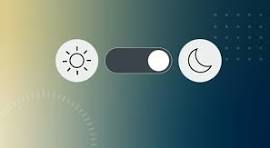
Step 3: Implement a Toggle Switch
Provide users with a toggle switch to switch between light and dark modes. This can be done using JavaScript.
const toggleSwitch = document.querySelector('#toggle');

toggleSwitch.addEventListener('change', () => {
    if (toggleSwitch.checked) {
        document.documentElement.setAttribute('data-theme', 'dark');
    } else {
        document.documentElement.setAttribute('data-theme', 'light');
    }
});
Step 4: Test Across Devices
Ensure that your dark mode design is tested across various devices and screen sizes to maintain consistency and usability.
Practical Examples of Dark Mode Design
Many popular applications have successfully implemented dark mode. Here are a few notable examples:
- Twitter: Offers a seamless transition between light and dark modes, enhancing user engagement.
- Slack: Provides a customizable dark mode that allows users to choose their preferred color scheme.
- Google Chrome: Features a dark mode that applies to the browser interface and web content.
Best Practices for Dark Mode Design
To ensure a successful dark mode implementation, consider the following best practices:
- Maintain sufficient contrast between text and background colors.
- Use color palettes that are easy on the eyes and avoid overly bright colors.
- Test your design in various lighting conditions to ensure usability.
- Provide users with the option to schedule dark mode based on their preferences.
Case Studies and Statistics
Research indicates that dark mode can significantly enhance user experience. A study by the Nielsen Norman Group found that users prefer dark mode for its aesthetic appeal and reduced eye strain. Additionally, a survey conducted by Android Authority revealed that over 80% of respondents use dark mode on their devices.
Conclusion
Dark mode design is not just a trend; it is a valuable feature that enhances user experience and accessibility. By following the configuration steps outlined in this guide, utilizing practical examples, and adhering to best practices, you can create an effective dark mode for your application. Remember to test your design thoroughly and consider user feedback to refine the experience further. Embrace dark mode as a standard feature in your design toolkit to meet the evolving needs of your users.